This is a TED Talk by Robert Ballard, deep-sea explorer.

If you can, watch it without listening to the words, just to the pitch of his voice, especially about half way through the talk, at about 7.30.

The majority of his speech is incredibly monotonous.

He gives the impression that he is ashamed of what he is saying, that his audience will find it boring and that it needs to be hurried, get it out of the way as soon as it can be done.

There were times when I thought I would stop watching.

It was that bad!

I didn't stop watching.

Why?

Because ...

he compensated with some fabulous, very successful strategies that had his audience engaged despite the monotony.

What were these strategies and can we use them ourselves?

There were six that I noted, and all of them are powerful - they needed to be!!

1. The message is simple and strong

He has a very simple, well articulated message. Why are we spending so much time and money on space exploration and so little on exploring our oceans? It is repeated. The whole presentation supports it. And the fact that it is regularly stated as a question keeps it hooked into his audience's minds and hearts.

2. He uses the unexpected

Several of his statements stand out for me but there are others. The first that aroused my attention was the one about how everything he learned at school in his field was wrong. The second was about the map. Normally when we see a blank space on a map we assume it is just an area of similar topography. A space like that on a map of the sea is blank because it is not mapped. Life under the sea exists in ways no life should. Water is upside down. Volcanoes work in ways volcanoes shouldn't. He sets his audience up and hits them regularly with the unexpected and each point made that way hits strongly.

3. He uses images.

There are 57 image slides in this presentation with no words. There is no conflict in his audience's minds between spoken and written words. The images reinforce what he is saying and his audience is more likely to remember a point made and supported by an image than one that is only made verbally. I can still see in my mind's eye the little girl with her mouth open in amazement.

4. Humour

He's not exactly a humorous speaker, nor a comedian, but he uses subtle humour, and again often the unexpected. There is self effacing humour, and his use of the name Easter Bunny, the statement "I would not let an adult drive a robot. He doesn't have the gaming experience." just three examples. And the audience laughs. But they laugh and they are acknowledging the humour but they are also being drawn to the point he is making at the time. The humour simply highlights it.

5. Clever use of Pause

Robert uses pause to highlight a particular point and his uses it powerfully, interspersing it between questions and single words.

He also uses pause as an antidote to a long session of fast-paced narrative. And that is powerful too.

6. Repetition

He repeated the main message. He repeated his main points. He repeated his humorous "Easter Bunny" statement. And it wasn't saying the same thing over again. It was calling back to it, later in the speech. It's a powerful technique, puts the segment just completed, monotonous though it may be, into perspective and creates support for the point he is making, or the idea he has introduced.

7. Passion

This man believes in what he is doing.

He is excited by it.

He is passionate about the possibilities it offers and about creating excitement in his audience and in the world, about his project.

And it shows, when he allows it, in his use of pause, in his enthusiasm, and in his energy.

These are not rhetorical devices he just inserted into his speech. They are the result of his enthusiasm and dedication and excitement.

He left the best for last when he talked about being able to ignite that same enthusiasm and excitement in middle-schoolers, when he talked about "creating the classroom of the future" and how you "win or lose a scientist by 8th grade".

This is what we want.  This is a young lady not watching a football game, not watching a basketball game.  She's watching exploration thousands of miles away and it's just dawning on her what she is seeing.  And when you get a jaw dropping, you can inform, you can put so much information into that mind ...

This is what we want. This is a young lady not watching a football game, not watching a basketball game. She's watching exploration thousands of miles away and it's just dawning on her what she is seeing. And when you get a jaw dropping, you can inform, you can put so much information into that mind ...

And he had a standing ovation.

Monotonous, maybe, boring no!

beauty_data

Images are becoming the new language of content communication.

As David McCandless says ... "We are being blasted every day, all of us are being blasted by information design. It's being poured into our eyes by the web and we're all visualisers now, we're all demanding a visual aspect to our information and there's something magical about visual information."

The fact that "a picture paints a thousand words" is now mainstream.

As speakers, we use them in our social media. We use them in our blogs. We use them in our presentations.

"By visualizing information, we turn it into a landscape that you can explore with your eyes, a sort of information map. And when you’re lost in information, an information map is kind of useful." says David McCandless.

If you've watched this TED talk than you will know ... if not, then watch right now, and know ... that David McCandless inspires with his presentation style, and his amazing ways of designing infographics.

Be reminded of, and inspired by, the possibilities for you as a presenter, and renew your enthusiasm for creating graphics that will allow your audiences, the visitors to your websites and your social media peeps to understand that you have the power to create meaning for them.


We've all been there: an Excel spreadsheet smeared across a projector screen as someone on stage mumbles into a microphone while you sneakily check your email on your phone just to stay awake. It’s presentation hell, and we've all been there before. But it doesn't have to be this way, especially when you’re the one delivering the presentation.

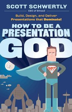
As founder of presentation design firm Ethos3, Scott Schwertly knows the difference between a great presentation and a great reason for an audience to take a nap. In How to Be a Presentation God, Schwertly begins to right the multitude of wrongs we have endured at the hands of dull speakers and poorly crafted presentations.


ISBN 978-0470915844
Format Hardcover
Publisher John Wiley and Sons Ltd
Published United Kingdom, 2011-03-08


Focuses on content, design, and delivery

Build, design, and deliver a fire-breathing, wing-flapping, roar-bellowing behemoth of a presentation. Unlike most presentation books that say the same things regarding presentation design and delivery (less is more, get rid of bullets and use images, emulate Steve Jobs, and so on), "How to Be a Presentation God" actually divulges step-by-step secrets for how to build, design, and deliver blockbuster presentations. By providing entertaining and clever presentation insights, veteran presenter Scott Schwertly gives you the in's and out's for presenting yourself, your business, and your cause with an easy-to-implement approach.

Have your audience praising the heavens and hanging on your every word. You’ll find proven and effective step-by-step secrets for delivering transcendent presentations with an easy-to-implement approach focused on engaging content, personal storytelling, and effective design elements—the holy trinity that leads to godly delivery.

As a presenter, your job is to move people, and anything less is merely wasted time. Presentations matter. We use them to convince others to do more, think differently, or invest in our ideas. Yet most of us can’t seem to muster the forethought, passion, and execution that our ideas deserve. If you've got a presentation to deliver, it’s probably important to you. So treat it that way.

How to Be a Presentation God gives you the tools you need to deliver when it matters and fulfill your own passion and vision for what can and should be. When people take time out of their day to sit and listen to you speak, not boring them to death is the least you can do. Packed with examples and lessons from great presenters—from Abraham Lincoln to Steve Jobs—this book shows you how to beat the boredom, flip your script, and start changing the world . . . one presentation at a time.

About the Author

SCOTT SCHWERTLY is founder of Ethos3 Communications, a presentation design and training firm with a client list that includes companies like Google and Pepsi, as well as successful speakers like Guy Kawasaki. And it's no wonder, since Ethos3 placed first in the business category at SlideShare's World's Best Presentation contest. Learn more at www.ethos3.com.


Here are my affiliate links, that I provide only for the books I recommend.

Thanks for clicking through, the few extra cents that I earn are always welcome!


Amazon     Book Depository

11_deadly_presentation

"We've all committed the 11 deadly presentation sins on the way up in our careers. This insightful book will help make sure that your way up doesn't become the way down!"
- Dr. Nick Morgan, author of Give Your Speech, Change the World

11 Deadly Presentation Sins is the perfect book for public speakers, business presenters, PowerPoint users and anyone who has to get up and talk in front of an audience. 

Few skills are more important in business or in life than the ability to present your ideas in clear and compelling terms. A solid presentation can help you:

* Close a sale with a customer
* Earn a raise
* Get a job
* Boost your reputation in the marketplace
* And much more ... 

Escape From PowerPoint Hell ...

More Than 100 Practical Tips ...

Did We Mention Fun? 

My review

Want to avoid killing your audiences with boredom? Are you killing your career, your business, your chances of winning that pitch with murderous presentations? Sin no more. Resurrect your speaking success with Rob Biesenbach's new book.

Rob brings skills as an actor, a speaker and a PR pro to this book; and not just skills but the entertaining, engaging communication style that made him a success there.

If you want to build your own success as a speaker, use this book. I don't like books that tell you what NOT to do, and I feared that "deadly presentation sins" might do just that. I was mistaken, and happily so. The book is incredibly positive and encouraging. Rob provides the theory and the fundamentals of presentation success from energy to engagement, from storytelling to structure, from focus to visuals and much, much more.

I enjoyed his conversational style, his humour and his turn of phrase. Especially I enjoyed his humility. These all add up to an encouraging, easy read. He uses examples from other experts. He also uses copious examples from his own experience, so I felt that this was guidance from an expert. More importantly, though, these examples give Rob's readers a multitude of practical ways to implement the strategies he has listed. This is what takes the book beyond being just another basic read about presentation skills.

Implement the guidance here and yes you will stand out - confident, comfortable and more engaging.
This is indeed the path to redemption!

You can get all the details (and where to buy the book) here on my website ... http://bit.ly/1c6rP0Y

Presenting data is a very difficult challenge. The first step is engaging the audience with a strong emphasis on why it is important for them to understand what is being presented. Nevertheless they do need to be able to understand the data you present. While ensuring its relevance is understood is vital, so is it vital that your audience understand each and every piece of data that you present, or they will just as surely switch off, and your outcome is lost.  

Visuals are very useful here. Use pie graphs and bar charts; insert them into your slides if you are using slides. If you are using a whiteboard, draw as you tell the story or make the point. If you are using PREZi you can let the audience look at the data from different angles. The visual representation will reinforce your explanation and the point you are making.

If it is necessary to use graphs, diagrams and charts, make sure they are as simple as possible. While you probably want to impress with your understanding of complicated data, being able to simplify it will have far more of an impact, particularly in terms of getting your message across.

And make sure that everything about those visuals is clear. Sometimes it’s necessary to explain so that all the implications are clear as well. There may have been a very good reason for choosing the axes in the graph. There may have been a very good reason for choosing the increments that are used. While it may seem obvious to you, it may not be to the audience, and it may make the data relationships clearer.   
You can also add to the impact of the visuals. There may be a story behind the points on a graph. It is the intersection of two values and maybe the relationship is reasonably clear. But if you can give the reason why this relationship exists or maybe the history behind it, then it will be so much clearer.  And if you can put a human face on it, with a human story then the relationship and the point you are using it for will have so much more impact. If wages are going down and costs of living rising, for example,  then a story about a family forced to live in a car will make the impact so much more real. Another way to add a human face, or a realistic face, is to use a graphic representing the actual item being quantified. This can be particularly useful in a bar graph. If the bar consists of pictures of dollar coins to represent money, or of groups of people to represent populations or groups, for example, again the impact is multiplied.  

In the midst of all this, it is important to remember, still, that you are presenting points towards a persuasion of some kind. It can be useful to have the point you are making as the heading for the slide that contains the visuals.

And while the visuals should be as detailed as is necessary to make them understandable, too much detail will overwhelm. Remember the visuals only need to make a point, not necessarily present all the data. If all the data is necessary for later inspection and verification, put it in a handout, and leave the slides as simple as they can be.

Visuals are your greatest ally in presenting data. They can add impact and keep your audience engaged with the thread of your message. Your simplification and design of the material to support that message and the thoughtful explanation you add to it, will support the success of your data presentation.

©2012 Bronwyn Ritchie
Please feel free to reproduce this article, but please ensure it is accompanied by this resource box.

Bronwyn Ritchie has 30 years’ experience speaking to audiences and training in public speaking – from those too nervous to say their own name in front of an audience to community groups to corporate executives. To receive her fortnightly free tips, articles, quotations and resources, subscribe now, it's free!. Visit http://www.pivotalpublicspeaking.com/ps_ezine.htm

Carmine spoke to an audience of grad students at the UC Berkeley Haas School of Business. His topic: The New Rules of Persuasive Presentations pulled from his best-selling book The Presentation Secrets of Steve Jobs. Here's an excerpt.

the New Rules of Persuasive speaking

=> http://bit.ly/YNd0Je

Are you still creating PowerPoint slides with lots of bullets and text? This 4-min. video will revolutionize how you create presentations. You'll see a makeover, step-by-step, that gets rid of a distracting background and turns a boring, bulleted slide into a clear, image-rich presentation. 

=> http://bit.ly/12Dg4WN

An Open Letter to Steve Ballmer

Dear Steve,

How are things..? It looks to have been a bumpy few months for you but it all seems to be coming together for you now. Nicely played…

We wanted to drop you a line to firstly commend you, secondly to point out some “opportunities for improvement” and lastly to suggest something a little “out there”. Bear with us…we think you’ll like it.

So firstly, the commendation – PowerPoint 2010 is really very very good.... => http://bit.ly/i9cBRH

Say It With Charts: The Executive's Guide to Visual Communication

Gene Zelazny

Look to this comprehensive presentation encyclopedia for information on: how to prepare different types of charts - pie, bar, column, line, or dot - and when to use each; hands-on recommendations on lettering size, color choice, appropriate chart types, and more; and, techniques for producing dramatic e-Visuals using animation, scanned images, sound, video, and links to pertinent websites.

'Say It With Charts, 4th Edition", shows you how to put your message in visual form and translate information and ideas into persuasive, powerful charts, visuals, and multimedia presentations - holding your audience's attention as you communicate exactly what you want, with no confusion.

http://bit.ly/UUyGxS
.

Dan Heath, co-author of Made to Stick, speaks with Fast Company on how to avoid “that dreaded bullet-drenched PowerPoint that everybody hates”.


http://bit.ly/Oi8RnP